Naturorganica® – Lion’s Mane (Hericium Erinaceus) Mushroom Extract
Project Snapshot
- Client: Naturorganica® – German premium natural supplements brand
- Product: Lion’s Mane 20:1 Extract, 500 mg (100 mg polysaccharides), 120 vegan capsules
- Markets: Germany, wider EU (multilingual: DE / EN / FR)
- Role: Brand & Packaging Designer
- Scope: Product label design, visual system for future SKUs, hero mockups for Amazon & web
- Tools: Adobe Illustrator, Photoshop (mockups / retouching), 3D mockup generator

1. Background & Brief
Naturorganica® is a German premium supplements brand focused on nature‑powered wellness, minimalism, and sophistication. As they expanded their range of functional mushroom products across Europe, they started a full visual rebrand.
The Lion’s Mane (Hericium erinaceus) supplement was one of the first products to carry the new identity. The goal: create a recognizable, compliant, and premium label that would:
- Stand out on crowded Amazon supplement listings
- Clearly communicate nootropic & cognitive benefits
- Work seamlessly in three languages (German, English, French)
- Lay the groundwork for a cohesive label system across the entire portfolio
2. Research & Strategic Foundations
Market & Competitor Analysis
I started by analysing:
- Top‑selling Lion’s Mane supplements on Amazon.de and Amazon EU
- Design patterns in nootropic and adaptogen packaging
- Regulatory and layout conventions for EU food supplements
Key findings:
- Most competitors leaned heavily on clinical / pharmaceutical white or overly busy “eco” graphics.
- On Amazon, many labels became illegible at thumbnail size.
- Claims like “high potency extract”, “vegan” and “polysaccharide content” were often buried in small text.
This highlighted a gap for a clean, minimal, premium look that still feels natural and is instantly readable online.
User Insight
Naturorganica’s target customer is:
- Health‑conscious, often 25–45, interested in biohacking, focus, and long‑term brain health
- Skeptical of hype; looks for trust signals, clear information, and European production
- Shopping mainly online, especially Amazon, where decisions are made in seconds
This informed every design decision: clarity first, then beauty.
3. Design Goals
From the brief and research I distilled six clear objectives:
- Brand Recognition
Make Naturorganica instantly recognizable inside the Amazon feed and on a physical shelf. - Premium Positioning
Use a refined visual language (color, typography, negative space) to justify a higher price point. - Nature + Science Balance
Communicate organic, plant‑based origin and evidence‑based efficacy simultaneously. - Multilingual Clarity
Integrate German, English, and French without feeling crowded or confusing. - Regulatory Compliance
Respect EU supplement labeling norms while keeping the aesthetic clean. - Scalable System
Create a structure that can scale to future SKUs (Reishi, Cordyceps, Ashwagandha, etc.) with minimal redesign.
4. Concept & Visual Direction – “Sunrise Clarity”
The brand’s core mark is a stylized sun rising over a horizon.
I built the concept around the idea of:
“A clear new day for your mind.”
Lion’s Mane is associated with focus, memory, and cognitive support. The sunrise symbol became a metaphor for mental clarity, while the surrounding visuals rooted the product in forest ecology and natural intelligence.
Color Palette
I refined a restrained, premium palette:
- Deep forest green – primary brand color
- Conveys nature, depth, and trust
- Strong contrast against white and gold
- Soft metallic gold – accent
- Signals premium quality and warmth
- Used in the sunrise logo and key highlights
- Clean white – main background
- Allows typography to breathe
- Feels clinical enough for supplements without becoming cold
- Amber glass bottle
- A classic apothecary cue, instantly signaling “supplement” and “quality”
- Protects capsules from light (functional and aesthetic)
This palette balances organic warmth with pharmaceutical clarity.
Typography
The core typeface is Nirmala UI, chosen for:
- Excellent legibility at small sizes
- Great support for European characters and multilingual text
- Neutral but modern personality, aligning with minimalist sophistication
Headings are set in strong weights for immediate impact, and supporting text uses lighter weights for comfortable reading.
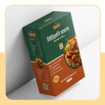
5. Label Design Solution
5.1 Front Label – Instant Clarity at Thumbnail Size
The front label is where brand recognition, product information, and Amazon performance meet.
Layout & Hierarchy
I divided the face into two strong vertical blocks:
- Left block – Brand column (deep forest green)
- Carries the sunrise icon in gold and the NATURORGANICA wordmark
- Acts as a brand “spine” that will remain consistent across all future SKUs
- Gives the label a distinctive asymmetry that stands out in search results
- Right block – Product information (white)
- Clean, high‑contrast space for key information
- Structured from top to bottom in a clear hierarchy:
- Brand name (for trust recognition)
- Product name: “Lion’s Mane” – large, confident serif‑like setting
- Scientific name: Hericium erinaceus – smaller, italicized, for credibility
- Potency band: a gold strip reading
“20:1 Extract · 100 mg Polysaccharides”
This quickly communicates strength and active component. - Descriptor line:
“Premium Adaptogenic & Vegan Mushroom Extract”
Summarises category, lifestyle fit, and quality. - Benefit line (bottom):
“Focus, Memory & Cognitive Balance”
Communicates outcomes instead of vague “wellness”.
Readability & Amazon Performance
Every front‑label text element was tested at small scale to ensure:
- The word “Lion’s Mane” remains readable in Amazon thumbnails
- The client’s name Naturorganica is clear on both desktop and mobile
- The potency band remains legible enough to attract more informed buyers
5.2 Back Label – Multilingual Information Architecture
The back label had to carry all regulatory and usage information in German, English, and French, plus branding and icons, without becoming a wall of text.
Structure
- Intro paragraph – brand story & wellness positioning
- Supplement facts & usage – dosage, warnings, storage
- Multilingual blocks – carefully broken into short paragraphs per language
- Pictogram row – to summarise key info visually
- Capsule count: “120” icon
- Net weight: “93,6 g”
- Vegan / plant‑based indicator
- Brand URLs & Social Handles – subtle but visible at the base
- Tagline strip at the bottom:
“Naturorganica® invites you inward – nature supporting you”
Design Considerations
- Consistent line lengths and enough leading to keep the text airy, despite the information density.
- Color contrast: white text on deep green meets accessibility standards while matching the front.
- Delicate use of gold accent lines to separate sections without heavy boxes or clutter.
The result is a calm, readable back panel that respects EU supplement guidelines and still feels premium.
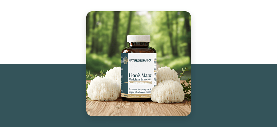
6. Visual Presentation & Mockups
To support Naturorganica on Amazon and their website, I created a series of high‑impact mockups and lifestyle images.
Hero Image
- The amber bottle is placed on a natural wooden surface.
- Fresh Lion’s Mane mushrooms surround the product, visually linking the capsule contents to their whole‑food origin.
- The background is a soft‑focus green forest, echoing the deep green brand color and reinforcing the “nature‑powered” promise.
This composition:
- Creates a clear, organic context for the supplement
- Works as a versatile hero image for Amazon listings, social ads, and website banners
- Reinforces the Sunrise Clarity concept – a calm morning in the forest, supporting mental focus
Additional close‑up renders showcase:
- The gold sunrise logo embossed effect
- The clean typography and structured back‑label layout
- The amber glass texture, signaling quality
7. Challenges & Solutions
7.1 Multilingual Content on a Small Surface
Challenge:
Three languages, disclaimers, dosage info, and branding had to coexist on a limited label width.
Solution:
- Created a strict typographic hierarchy (headline, subheadline, body, micro copy).
- Grouped each language into its clearly defined block, separated by subtle spacing—not heavy borders.
- Used a typeface optimized for small text and European character sets.
- Prioritized legibility over decorative elements; every graphical flourish had to justify its space.
7.2 Standing Out in a Saturated Amazon Category
Challenge:
Lion’s Mane and mushroom supplements are a crowded niche with many visually similar products.
Solution:
- Chose an asymmetrical front layout that visually “breaks” the typical centered label pattern.
- Emphasized the Sunrise icon as a unique brand anchor.
- Balanced premium gold accents with deep forest green, avoiding both generic white‑clinical and over‑earthy aesthetics.
- Highlighted potency (20:1), polysaccharides, and vegan status clearly on the front to differentiate on spec, not just style.
7.3 Building a Scalable System
Challenge:
This label had to be the blueprint for an entire line of products yet to come.
Solution:
- Locked in a modular grid: brand column + product column that can be reused.
- Defined rules for color swapping (e.g., accent color variations for different mushroom types if needed).
- Established type styles, spacing, and icon language that can be reused across future SKUs.
8. Outcome & Learnings
The final Naturorganica Lion’s Mane label:
- Aligns fully with the new Naturorganica identity – minimal, nature‑centric, sophisticated.
- Creates a distinct visual signature through the vertical brand column and sunrise icon.
- Communicates key selling points—20:1 extract, 100 mg polysaccharides, vegan, 120 capsules, European production—at a glance.
- Provides a scalable design system for Naturorganica’s growing supplement range.
As this product rolls out across European markets, success can be measured by:
- Amazon listing performance (CTR, session conversion rate)
- Customer reviews mentioning packaging / clarity
- Brand recall as seen in repeat purchase behavior
From a design perspective, this project reinforced the value of:
- Treating Amazon thumbnails as seriously as full‑size packaging.
- Building a design system, not a one‑off label.
- Keeping information architecture at the heart of supplement design: clarity builds trust.
9. SEO Add‑Ons for Your Portfolio
You can use or adapt the following to optimise this case study for search:
Suggested Meta Description (150–160 characters)
“Premium supplement label design for Naturorganica’s Lion’s Mane mushroom extract. Minimal, multilingual packaging crafted for Amazon and European markets.”
Suggested SEO Keywords
- supplement label design
- Lion’s Mane label design
- mushroom supplement packaging
- Naturorganica branding
- nootropic packaging design
- premium nutraceutical label
- Amazon supplement packaging
- vegan mushroom capsules design
Suggested Image Alt Text
- “Naturorganica Lion’s Mane supplement label on amber bottle with fresh lion’s mane mushrooms in a forest background.”
- “Front view of Naturorganica Lion’s Mane packaging showing premium minimal supplement label design.”
- “Back label of Naturorganica Lion’s Mane bottle with multilingual supplement information.”
- “Naturorganica logo system and brand guidelines with sunrise icon, typography, and color palette.”