Biriyani Masala – Bengali Spice Box
Project Overview
- Client: A Bengali home‑style spice brand (Bangladesh)
- Product: Biriyani Masala – 200 g premium spice blend
- Category: FMCG / Food & Beverage / Spice Mix
- Role: Packaging Designer (concept → print‑ready artwork + mockups)
- Deliverables:
- Full carton design (front, sides, back, top, bottom)
- Retail & e‑commerce mockups
- Basic visual system for future SKUs
1. Background & Brief
The client is a growing Bangladeshi spice company that started from a small home kitchen and is now entering modern supermarkets and online grocery platforms. Their biriyani mix is one of their hero products, loved for its “restaurant‑style” flavor with home‑made authenticity.
The existing packaging looked generic and did not reflect:
- The rich tradition of Bengali biriyani
- The quality and hygiene standards of the brand
- The need to stand out on crowded retail shelves
My task was to design a new Biriyani Masala box that would feel:
- Warm and homely, rooted in Bengali culture
- Trustworthy and premium enough for modern retail
- Clear and easy to understand for all customer segments
2. Design Goals
From the brief and discovery conversations, I defined five core goals:
- Shelf Impact – Make the box immediately visible and appetizing in a sea of similar spice packs.
- Cultural Authenticity – Celebrate Bengali language, colors, and food culture.
- Trust & Hygiene – Communicate purity, safety, and quality certifications.
- Clarity & Usability – Present information (benefits, ingredients, instructions) in a way that’s readable at a glance.
- Scalability – Create a layout that can be adapted to other spice SKUs in the future.
3. Strategy & Research
Market Scan
I analyzed competitive packaging from:
- Leading Bangladeshi spice brands
- Indian and Pakistani biriyani masala brands sold in local markets
- International ethnic food brands available online
Key observations:
- Lot of visual noise – extremely busy packs with many colors and fonts.
- Food imagery often looked over‑processed or artificial, undermining trust.
- Branding sometimes got lost behind product photography and claims.
The opportunity: a cleaner, more structured design that still feels traditional and festive.
Consumer Insight
The primary buyers are:
- Home cooks (often women) who cook family meals
- Younger professionals who want “hotel‑style biriyani at home”
- Diaspora Bangladeshis buying online, looking for a taste of home
For them, language, nostalgia, and visual taste cues matter as much as price.
4. Creative Concept – “Restaurant Taste, Home Kitchen Story”
The core idea of the design:
Bring restaurant‑level biriyani flavour into the everyday Bengali kitchen, with the warmth of home and the trust of a certified brand.
Visually, this became:
- A “home roof” icon in the logo area symbolizing the family kitchen.
- A rich, appetizing biriyani photograph that feels like a hot, freshly‑served dish.
- A warm color system inspired by spices, clay pots, and green chillies.
5. Visual Language
5.1 Color Palette
I built a two‑tone foundation:
- Deep Spice Green (upper part)
- Suggests freshness, herbs, and reliability.
- Differentiates from the bright yellows and reds used by many competitors.
- Terracotta / Burnt Orange (lower part)
- Inspired by clay pots, roasted spices, and the colour of slow‑cooked biriyani.
- Adds warmth and appetite appeal.
Accents in gold/yellow are used sparingly for:
- Quality badges (“High Quality”)
- Key benefit icons
- Small highlights around the food photo
This palette gives a premium, grounded feel without losing the festive vibrancy of South Asian cuisine.
5.2 Logo & Brand Mark
The existing brand logo features a house‑shaped outline with the name in Bangla. I refined its placement:
- Centered at the top, anchored in a small roof‑like frame.
- Acts as a symbol of “Gharer Ranna” – food made with care at home.
- Stays consistent across panels for brand recall.
5.3 Typography & Language Hierarchy
The pack uses Bangla as the primary language, supported by English transliteration:
- Large, bold Bangla title:“বিরিয়ানি মসলা” (Biriyani Masala)
- Under it, the English line:“BIRIYANI MASALA”
to make the product accessible to non‑Bengali readers and export markets.
Text treatment:
- Primary headings: bold, high‑contrast white on green for maximum legibility.
- Body text: clean, easy‑to-read Bangla type with comfortable spacing.
- Bullet points: used heavily to organise benefits, ingredients, and instructions.
5.4 Food Photography
The hero of the front panel is a top‑view photograph of a bowl of biriyani:
- Rich colour contrast – golden rice, browned meat, green chillies, fried onions, and coriander leaves.
- Placed within a circular frame on the right, partially breaking the green‑orange division to add depth.
- Intentionally styled to look like home‑cooked yet festive, not like generic stock food.
The food image instantly:
- Communicates product usage.
- Triggers appetite and emotion.
- Connects the consumer’s imagination to a real plate of biriyani at their table.
5.5 Patterns & Details
Subtle geometric spice motifs appear in the background of the green area:
- Adds richness without clutter.
- Creates a recognisable texture for the brand family.
A small QR code at the base of the front panel hints at modernity and digital engagement (recipes, brand story, etc.).
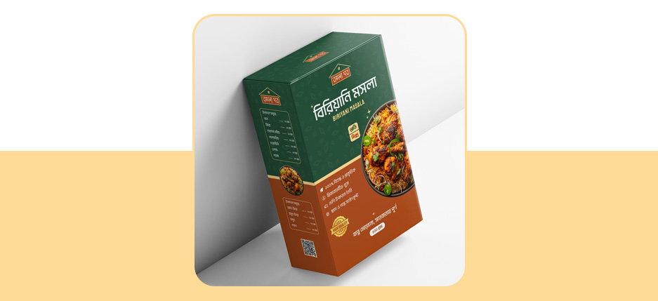
6. Front Panel – Story at a Glance
The front panel is structured to give shoppers all critical information within seconds.
From top to bottom:
- Logo & Brand Line – establishes identity and the “home kitchen” story.
- Product Name (Bangla + English) – large, central, and highly legible.
- Usage Tags – such as “বিফ / মাটন / চিকেন” (for beef, mutton, chicken biriyani) to show flexibility.
- Food Photo – placed on the right, visually balancing the text-heavy left side.
- Key Product Benefits (Bullets):
- 100% hygienic & quality checked
- Preservative‑free
- Authentic spices, carefully blended
- Strong aroma & balanced flavour
- Quality Seal / Badge – “HIGH QUALITY” ribbon to reassure first‑time buyers.
- Tagline in Bangla – a warm, emotional line about taste and freshness (e.g. “যত্নে মেশানো, সতেজতায় পূর্ণ”).
- Net Weight – “২০০ গ্রাম” clearly displayed at the bottom centre.
This hierarchy ensures customers understand what it is, why it’s better, and how much they get almost instantly.
7. Side Panel – Quick Info & Convenience
One key side is used as a functional dashboard:
- A stripped‑down ingredient or nutrition scale visual to make the pack feel modern and informative.
- Repetition of the food image in a smaller circle for recognition when packs are placed side‑by‑side.
- Additional bullet points summarising:
- Purity & hygiene
- “No artificial colour / no preservative” type claims
- Simple marks that are easy to read in a shop aisle
This helps shoppers who only see the side of the pack in crowded shelves.
8. Back Panel – Education, Storytelling & Compliance
The back panel does the heavier communication work.
8.1 Brand & Product Story
The upper section in green contains a short narrative in Bangla:
- A quick history of biriyani in Bengali culture.
- Explanation of how this masala is crafted to capture that traditional, layered flavour.
- Reinforcement of quality, hygiene, and authenticity.
This section builds emotional connection and justifies the brand’s premium position.
8.2 Ingredients List
A clear, bullet‑style list of ingredients:
- Key spices: cardamom, cloves, cinnamon, nutmeg, bay leaves, etc.
- Supports transparency and reassures health‑conscious customers.
- Helps buyers with allergies or specific preferences.
8.3 Cooking Instructions
The orange mid‑lower block is dedicated to step‑by‑step usage directions in Bangla:
- How much masala to use per kg of rice/meat.
- When to add it during cooking.
- Simple tips for best taste (e.g. frying the spices in ghee/oil first).
This turns the box into a practical kitchen guide, not just a product container.
8.4 Manufacturer & Certifications
At the bottom I organised:
- Manufacturer and marketing details (address, phone, email, website).
- Quality and safety icons: ISO, hygiene, vegetarian/non‑veg symbol as required, recycling marks, barcode.
- MRP information and batch/date area reserved for overprinting.
This area satisfies regulatory requirements and builds consumer trust.
9. Print & Production Considerations
While designing, I kept print realities in mind:
- Limited colour palette (green, orange, white, plus small accents) to control printing costs while still achieving impact.
- High contrast between text and background to remain readable under supermarket lighting.
- Clean edge areas for folds and glue flaps, ensuring no crucial text falls into creases.
- Artwork prepared with CMYK values and bleed, ready for offset or flexo printing based on the client’s chosen printer.
10. Result & Impact
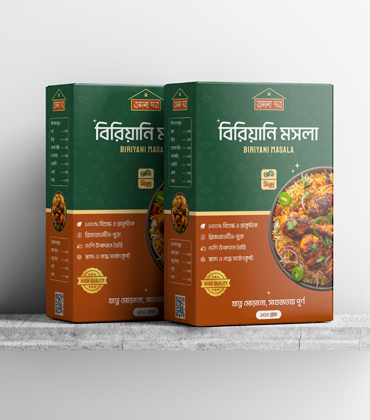
The final Biriyani Masala packaging:
- Stands out visually with its rich green‑orange split and strong food photography.
- Feels authentically Bengali through its Bangla‑first copy, cultural motifs, and homely logo.
- Conveys hygiene, quality, and transparency via clear benefit bullets and certification icons.
- Serves as a reusable design system for future spice variants (korma masala, curry masala, garam masala, etc.) by simply changing food photos, accent colours, and product names.
From a branding standpoint, the new box gives the client:
- Greater confidence approaching modern retail chains.
- A strong, appetising presence on e‑commerce thumbnails and marketplace listings.
- Story‑driven packaging that connects emotionally with customers who crave the taste of home‑made biriyani.
11. SEO Add‑Ons for Your Portfolio
You can use this section directly on your website, Behance, Dribbble, or LinkedIn and adjust the wording to match your voice.
Suggested Page Title
“Biriyani Masala Packaging Design Case Study | Bengali Spice Box Branding”
Suggested Meta Description (150–160 characters)
“Case study of a Bengali Biriyani Masala packaging design. A modern, hygienic spice box that blends home‑style tradition with premium retail branding.”
Suggested SEO Keywords
- biryani masala packaging design
- Biriyani Masala box design
- spice packaging design case study
- Bangla food packaging design
- Bengali spice brand identity
- FMCG packaging designer Bangladesh
- masala label design
- retail spice box branding
Suggested Alt Text for Images
- “Front view of Biriyani Masala spice box with green and orange Bengali packaging design.”
- “Back of Biriyani Masala packaging showing ingredients, cooking instructions, and brand story in Bangla.”
- “Two Biriyani Masala spice boxes on shelf with appetising biryani food photography.”